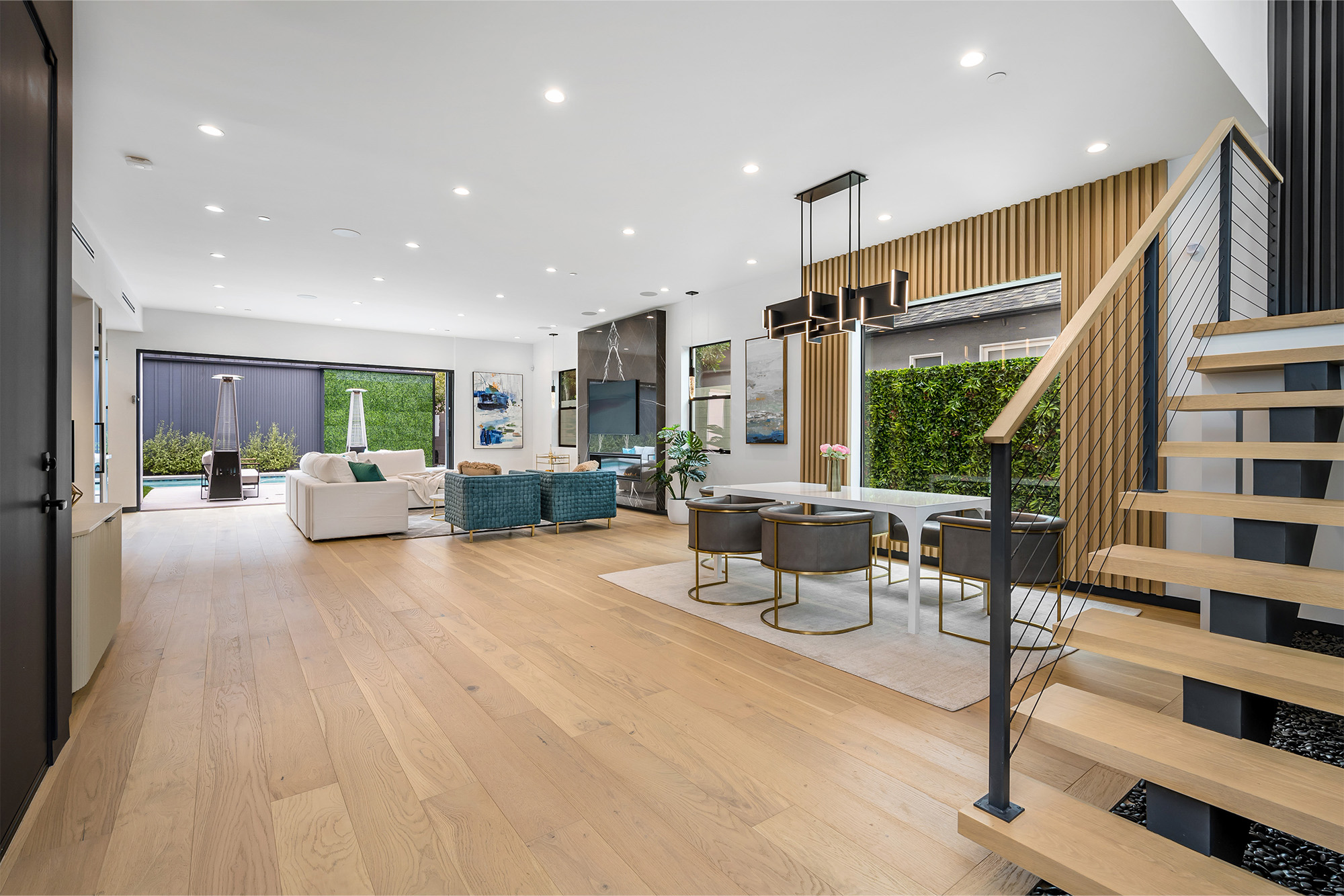
Open concept layouts ask more of a single flooring tone than a traditional room by room layout does. The same floor has to carry a kitchen, a dining area, and a living space at once, often under different lighting conditions throughout the day, without feeling flat in one zone or overwhelming in another. This makes tone selection one of the more consequential early decisions in an open concept spec.
Natural light plays a bigger role here than in a closed floor plan, since a tone that looks balanced near a bank of windows can shift noticeably as it moves toward the interior of the space. Reviewing a large sample across different points in the room, not just near the entry, gives a much more accurate read on how a tone will actually perform across the full layout.
Light Versus Warm Tones In A Shared Space
Lighter, more neutral tones tend to visually expand an open concept space and create a sense of continuity between zones that are otherwise defined by different furniture and function. This works particularly well in layouts with limited natural light, since lighter floors reflect more of what light is available.
Warmer, richer tones bring more visual weight and can help ground a large open space, especially one with a lot of glass or hard surfaces elsewhere. The tradeoff is that very saturated tones can start to feel heavy across a large continuous footprint, so many designers land on a mid tone that reads warm without overwhelming the space.
Keeping Tone Consistent Across Different Materials Nearby
Open concept kitchens usually sit adjacent to cabinetry, countertops, and sometimes exposed structural elements, all of which the floor tone needs to coexist with rather than compete against. A tone that looks great in isolation can clash once it is seen next to a specific cabinet finish or countertop material.
Bringing physical samples of nearby materials to a flooring conversation, rather than relying on photos or memory, makes this comparison far more reliable. Undertones in particular, the subtle pink, gray, or gold cast beneath a wood's main color, are easy to miss on screen and become obvious once samples sit side by side in the actual space.
Custom Matching For A Specific Design Intent
Because a single tone has to serve so many functions in an open layout, some projects call for a custom color match rather than a stock stain option. This gives more precise control over how the floor interacts with everything else in the space, particularly on larger projects where getting the tone right the first time matters more than usual.
At Urban Plank, we work directly with architects and designers on custom color matching for exactly this kind of layout, helping land on a tone that holds up consistently across an open floor plan rather than shifting from room to room.
If you are specifying flooring for an open concept project across Holland, Grand Rapids, Grand Haven, Traverse City, and Harbor Springs, MI, our team can help you think through tone, light, and adjacent materials before production begins. Explore custom color matched European oak or contact us to talk through your next layout, with full support available from Holland, MI.